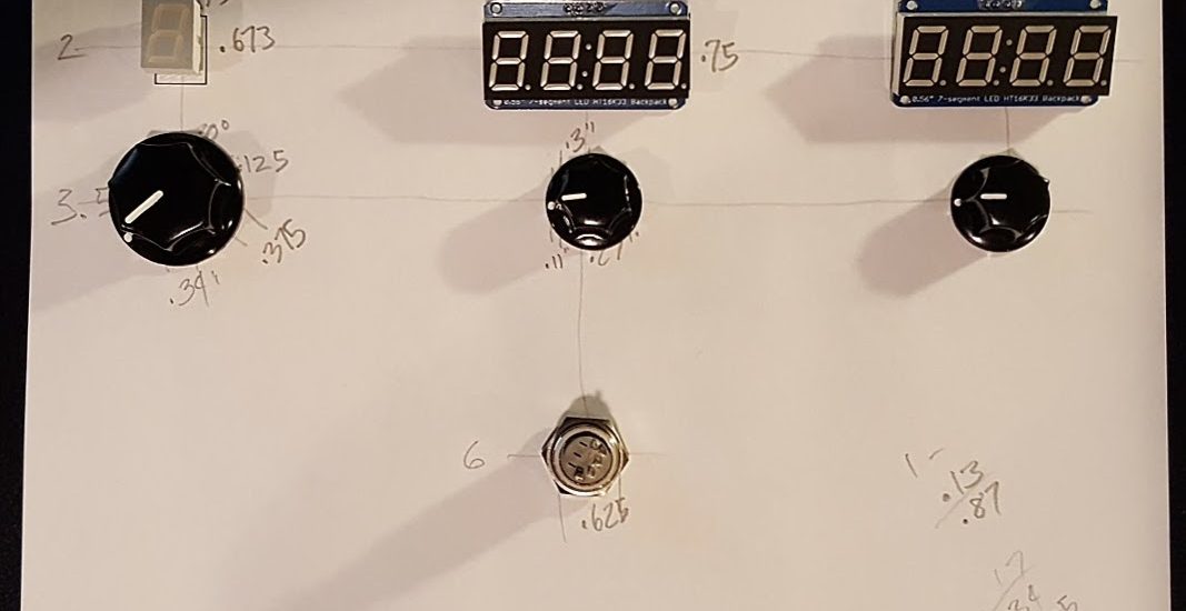
With the electronics taken care of, it’s time to turn attention to the display panel. This was paper prototyping at its essence: I moved displays, knobs and a switch around until the flow made sense. I have another set of displays, but while the extra numbers looked cool, it made the whole thing very confusing. There’s that lesson again, simplicity of UI prevails.

