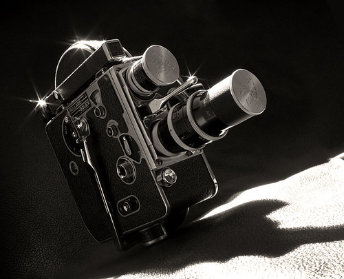
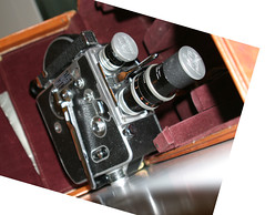
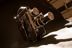
I wanted to create a beauty shot of my father's 16mm Bolex camera. Trying to find a unique angle to show it off with was my first challange. I wanted it to have that "Old Hollywood" feeling of looking up into the sky - the camera needed to feel bigger than life. So I first stood it up on a kitchen counter and moved around snapping pictures. I probably shot over 50 snapshots trying different angles, POVs and focal lengths. I'd shoot a couple dozen, review them on a large screen and shoot some more. I finally found the angle I wanted.
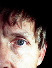
You can see from this image that I also rotated the chosen image to get exactly the angle I wanted.
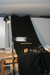
I then built a "set" for the camera on my workbench in the garage. I had a roll of leatherette that matched the texture on the camera left over from another project, so that was draped to create a background. I stuck a bolt through a 2x4 and had it come up through the fabric to mount the Bolex on, making the camera appear to stand on its own.
I hit it from the side with a soft light, and from the top with a very bright key light, masking both so they wouldn't light the background. The beautiful starry flares came for free. Using a printout of the test image as a guide, I adjusted my camera and tripod to match the angle and view as closely as possible.
Here's the original photograph that came from that session.
I wish I took a picture of this whole set up - it looked pretty kludged together, but it worked great. The only view that counted was the one through the lens.
In Photoshop I did some cropping and then had to fix the background. My background wasn't big enough to fill the frame, so the garage door filled it instead. There was also an annoying reflection below and to the left of the camera. Using some cut and paste and the clone stamp those problems were fixed. At this point I also ran a sharpening filter on the camera but not the leatherette.
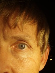
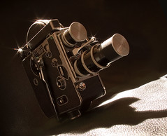
I pulled the saturation all the way down to black and white, and then added a #81 Warming Filter back onto it to, yep, warm it up a bit. (See image on left.)
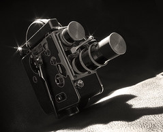
Finally, I pulled the brightness and contrast up pretty agressively (+23 and +25) to get the feeling I wanted. I don't mind the blown out foreground, in fact I think it helps to punch up the camera.
I'm really happy with this image. It delivers the feeling I was hoping to get and I think it does a great job of honoring the camera and our family history along with it.
The final image:
